Mobile-First Web Design: How Detroit Consumers Actually Browse and Buy
Detroit consumers browse and buy on mobile first. This E-E-A-T guide explains mobile-first web design, thumb zones, speed, and local search behavior with practical tips for Metro Detroit businesses.
Author
Terrell Okafor
Category
Web Design & User Experience
Read Time
8 min read
Published
August 24, 2026
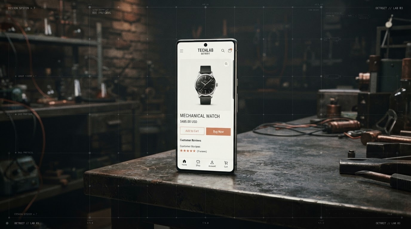
Walk down Woodward Avenue or through Somerset Collection and you will see the same behavior: heads down, phones out, searching, comparing, and buying. Mobile is not a secondary channel for Detroit consumers — it is the primary one. Google now indexes the mobile version of a site first, meaning your mobile experience determines both your search rankings and your conversion rates. This guide explains what mobile-first design really means and how Metro Detroit businesses can build experiences that match how people actually browse.
Key Takeaways
- 01Google indexes mobile versions of websites first, making mobile design a search ranking factor.
- 02The thumb zone — the lower-center of a phone screen — is where primary actions should live.
- 03Mobile load times under three seconds significantly reduce bounce rates.
- 04Simplified navigation and sticky CTAs improve mobile conversion.
- 05Local intent searches on mobile ('near me') require fast, location-aware pages.
What Mobile-First Design Actually Means
Mobile-first is a design philosophy, not just a responsive breakpoint. It means starting with the constraints of a small screen — limited width, touch input, slower connections, distracted users — and designing for those conditions before expanding to desktop.
This forces clarity. When you only have a 375-pixel-wide canvas, you must prioritize. You cannot hide weak messaging behind a wide layout. The result is usually a sharper, more focused experience on every device.
The Thumb Zone and Touch Targets
Most people hold a phone in one hand and navigate with their thumb. The comfortable reach area — the thumb zone — is the lower and center portion of the screen. Place primary buttons like 'Book Now' or 'Add to Cart' here, not in the top corners.
Touch targets should be at least 44x44 pixels with adequate spacing to prevent mis-taps. A common Detroit restaurant mistake is a tiny 'Order Online' link crammed into a desktop-style menu, impossible to tap accurately on a phone.
Healthcare sites like Monarch Lifestyle Medicine place consultation booking in the thumb-friendly zone, making it effortless for patients to schedule from a phone.
“If a Detroit customer cannot complete the key action with one thumb, the design has failed.”
Speed: The Mobile Conversion Killer
Mobile connections are variable — a customer on Woodward might be on 5G, while someone in a Rochester Hills parking garage is on slow LTE. Pages must load fast under poor conditions. Aim for a Largest Contentful Paint under 2.5 seconds.
Compress images, defer non-critical scripts, and use a content delivery network. Every additional second of load time drops conversion rates measurably. For local businesses, a slow mobile site means lost foot traffic.
Brands investing in performance infrastructure, like Studio Escrow for landing pages, gain a measurable edge in both speed and lead capture.
Local Intent: 'Near Me' Searches on Mobile
Mobile searches with 'near me' intent are how Detroit consumers find businesses while out and about. Your site must load instantly, show your address and hours prominently, and offer a one-tap call or directions button.
Structured data (LocalBusiness schema) helps search engines understand your location and hours, increasing the chance you appear in map packs. A fast, location-aware mobile page turns a search into a visit.
Creative agencies like House of Karma build local SEO into mobile-first designs, ensuring Detroit businesses appear when nearby customers search.
Simplified Navigation and Sticky CTAs
Mobile navigation should collapse into a clear hamburger menu with no more than five or six top-level items. A sticky bottom bar with a persistent call-to-action — 'Call,' 'Book,' or 'Shop' — keeps the next step always one tap away.
Avoid multi-level dropdown menus on mobile. They are hard to tap and frustrate users. Flatten your structure so the most important pages are reachable in one tap.
The Bottom Line
Mobile-first design is not a trend — it is the reality of how Detroit consumers interact with businesses. By respecting the thumb zone, optimizing for speed, and designing for local intent, Metro Detroit brands can turn mobile traffic into measurable growth.
Sources & References
- [1]Think with Google — Mobile-First Indexing
Google's official explanation of mobile-first indexing.
- [2]Nielsen Norman Group — Thumb Zones in Mobile Design
Research on touch target sizing and thumb-friendly layouts.
- [3]Google PageSpeed Insights
Free tool for testing mobile page performance.