7 Website Design Principles Every Detroit Brand Should Steal From the Motor City
A practical, E-E-A-T-focused guide to the website design principles that define high-performing Detroit brands — from visual hierarchy and typography to speed, accessibility, and conversion architecture.
Author
Priya Nandakumar
Category
Web Design & User Experience
Read Time
9 min read
Published
August 27, 2026
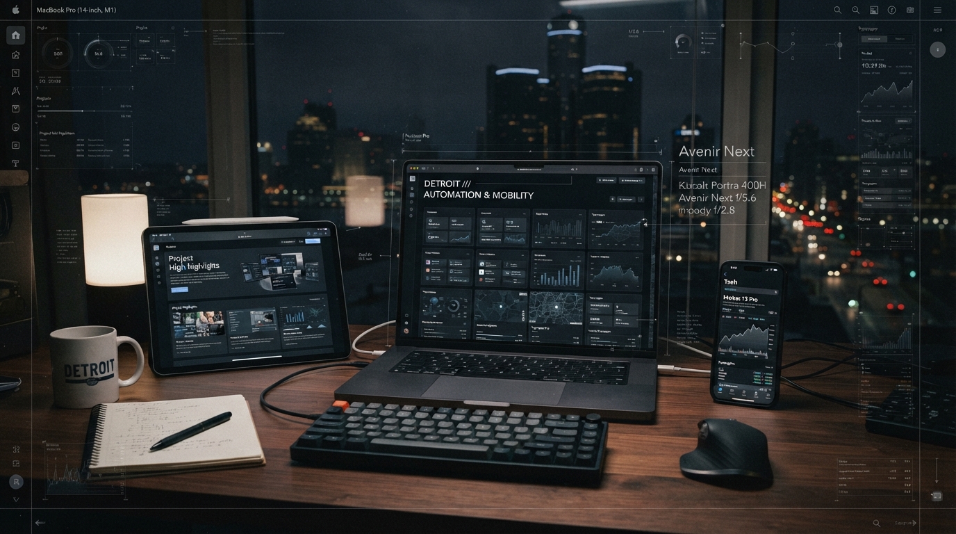
Detroit brands operate in a market where industrial grit meets creative reinvention, and a website should reflect that tension. A well-designed site is not decoration — it is the primary salesperson, receptionist, and brand ambassador working around the clock. The most effective Detroit websites, from creative agencies to medical clinics, share a set of design principles rooted in clarity, performance, and trust. This guide breaks down seven principles every Metro Detroit business can apply, using real local examples to show what separates a forgettable site from one that converts.
Key Takeaways
- 01Visual hierarchy guides the eye to the most important action on every page.
- 02Typography should reflect brand personality while remaining legible across devices.
- 03Mobile-first design is non-negotiable for Metro Detroit consumer traffic.
- 04Core Web Vitals directly influence both search rankings and user retention.
- 05Accessibility is a legal and ethical requirement, not an optional upgrade.
- 06Conversion architecture reduces friction between discovery and action.
- 07Consistent visual identity builds the trust needed for high-intent purchases.
1. Visual Hierarchy: Directing Attention Like Detroit Architecture
Detroit's skyline is a study in hierarchy — the Guardian Building's tiled arches draw the eye upward, while the Renaissance Center anchors the waterfront. A website should work the same way, using size, color, contrast, and spacing to lead visitors to the action that matters most.
Start with one primary call-to-action per page. A medical practice might prioritize 'Book a Consultation,' while a retail brand emphasizes 'Shop the Collection.' Secondary actions should be visually quieter so they never compete with the primary goal.
Brands like House of Karma demonstrate this principle by keeping navigation minimal and letting a single hero message dominate above the fold, a pattern that keeps bounce rates low and engagement high.
2. Typography That Speaks With a Detroit Voice
Typography is the voice of a brand before a single word is read. Detroit's design heritage — from automotive badges to Motown record sleeves — favors bold, confident typefaces with industrial roots. Pair a distinctive display font for headlines with a clean, highly legible body font for readability.
Avoid decorative fonts for body text. A common mistake is choosing a stylish serif for paragraphs, which hurts readability on mobile. Keep body text at 16px or larger, with line-height around 1.6 for comfortable scanning.
Art platforms like Karma by Design use expressive display type to convey creativity while keeping product descriptions in a neutral, readable face — a balance that supports both brand identity and commerce.
“Typography is the first impression a brand makes. In Detroit, it should feel engineered, not accidental.”
3. Mobile-First Design for a Mobile-Majority Market
The majority of Metro Detroit consumers now discover businesses on smartphones. A mobile-first approach means designing the smallest screen first, then scaling up — not the reverse. This forces discipline: if a layout works on a 375px-wide phone, it will work everywhere.
Test tap targets, form fields, and navigation on an actual device. A button that looks generous on desktop can become frustratingly small on mobile. Use a thumb-friendly minimum of 44x44 pixels for interactive elements.
Healthcare sites like Monarch Lifestyle Medicine prioritize mobile booking flows because patients research and schedule from their phones — a design choice that directly impacts appointment volume.
4. Core Web Vitals: Performance as a Ranking Signal
Google's Core Web Vitals — Largest Contentful Paint, Interaction to Next Paint, and Cumulative Layout Shift — measure how a page feels to a real user. A site that loads visually fast but shifts layout as images load will score poorly and frustrate visitors.
Optimize images with modern formats, lazy-load below-the-fold media, and preload critical fonts. Avoid heavy JavaScript that blocks interactivity. Performance is not just a technical checkbox; it is a competitive advantage in local search.
Platforms like Studio Escrow build performance into their landing page infrastructure, ensuring fast load times even on data-rich CRM and automation dashboards.
5. Accessibility: Designing for Every Detroit Resident
Accessibility means a website works for people with visual, motor, cognitive, or auditory differences. Following WCAG 2.1 guidelines — sufficient color contrast, keyboard navigation, descriptive alt text, and proper heading structure — is both a legal safeguard and a broader-reach strategy.
Detroit's diverse population includes older residents, non-native English speakers, and people with disabilities. An accessible site serves all of them, expanding your potential customer base while reducing legal risk.
Run automated audits with tools like Lighthouse, then manually test with a keyboard and screen reader. Accessibility is a continuous practice, not a one-time fix.
6. Conversion Architecture: Removing Friction
Every extra step between a visitor and their goal is friction. Conversion architecture maps the shortest path from landing to action. For a restaurant, that might be a prominent 'Reserve' button linking directly to a booking widget. For a clinic, a one-tap 'Call Now' button on mobile.
Reduce form fields to the minimum necessary. Each additional field lowers completion rates. Use progressive disclosure — asking for details only when they are truly needed — to keep initial commitment low.
Pair strong design with the automation that captures and follows up on inquiries. Integrating a site with a CRM ensures no lead falls through the cracks, a system Detroit agencies increasingly build as standard.
“The best website design is invisible. Visitors never notice the layout — they just reach the action they came for.”
7. Visual Identity Consistency Across Touchpoints
A website should not feel disconnected from a brand's physical space, social media, or packaging. Consistent color palettes, logo usage, photography style, and tone of voice build recognition and trust over time.
Detroit brands that succeed online treat their website as one expression of a unified identity. When a customer walks into a store after visiting the site, the experience should feel continuous, not jarring.
This consistency is what allows a local brand to scale nationally — the digital presence carries the same authority as the physical one.
The Bottom Line
Great website design for Detroit brands is not about chasing trends. It is about applying timeless principles — hierarchy, typography, performance, accessibility, and conversion clarity — with the confidence and craftsmanship the Motor City is known for. Whether you are a clinic, a restaurant, or a creative agency, these principles turn a website from a digital brochure into a growth engine.
Sources & References
- [1]Google Search Central — Core Web Vitals
Official Google guidance on loading, interactivity, and visual stability metrics.
- [2]W3C Web Content Accessibility Guidelines (WCAG) 2.1
International standard for accessible web content.
- [3]Nielsen Norman Group — Visual Hierarchy on the Web
Foundational UX research on how users scan and prioritize page elements.